Kiosk Check-in System
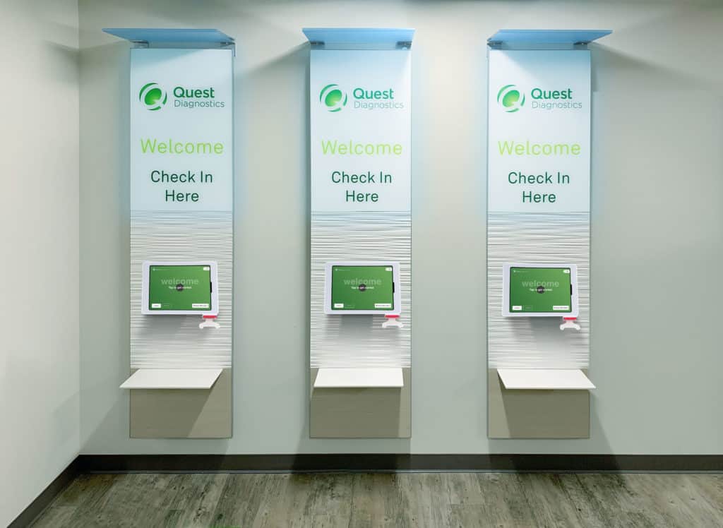
Project Impact
Research & Design Process
Problem Statement
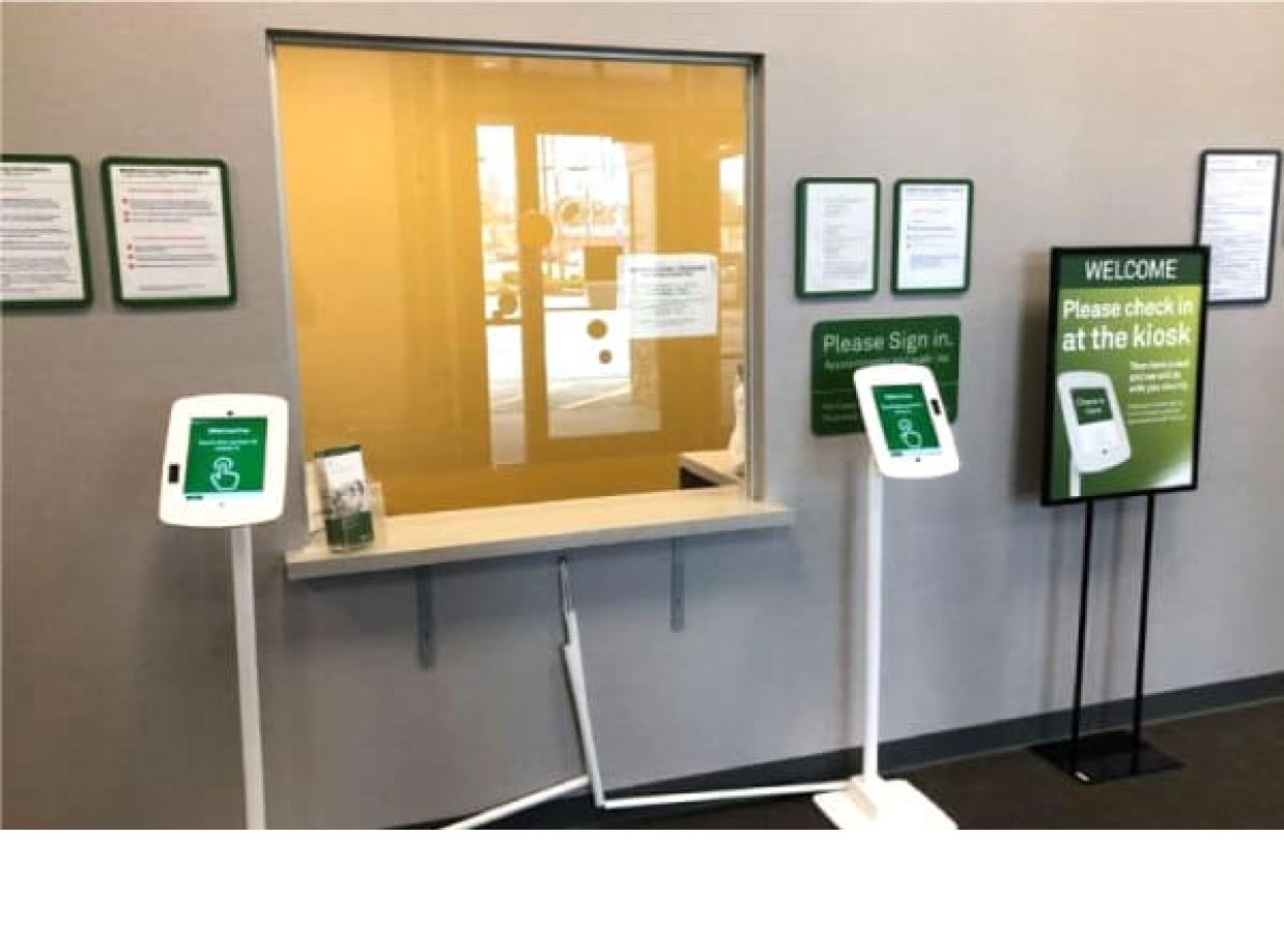
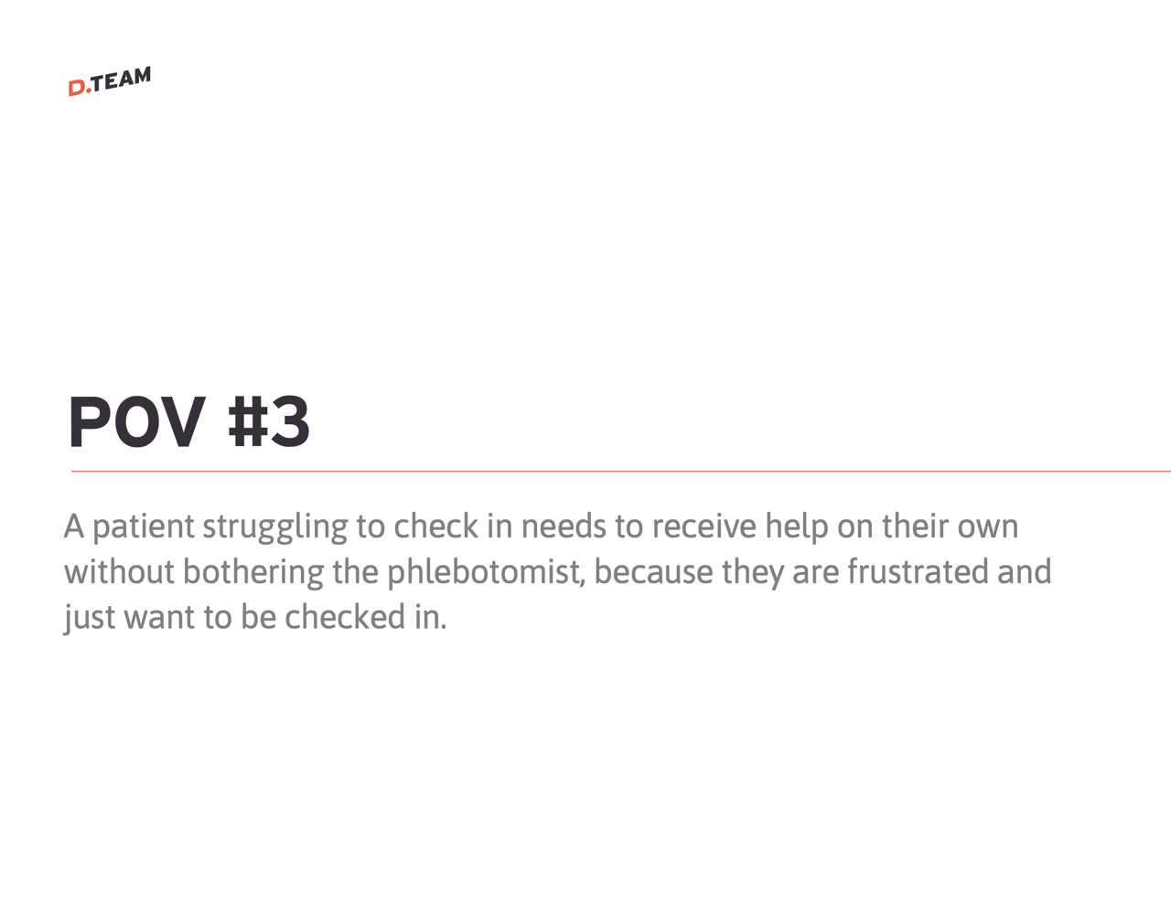
The check-in kiosk software lacks support for both scheduled appointments and walk-in customers. This limitation plus a slow check in process results in a subpar experience for walk-in customers.
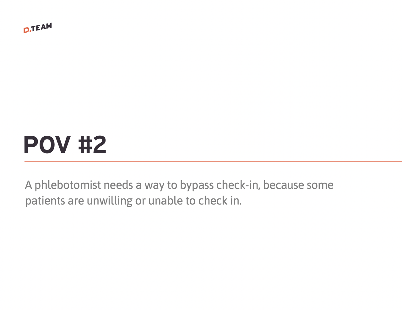
Additionally, it burdens phlebotomists with customer management tasks, distracting them from their primary duty of blood collection.
Solution
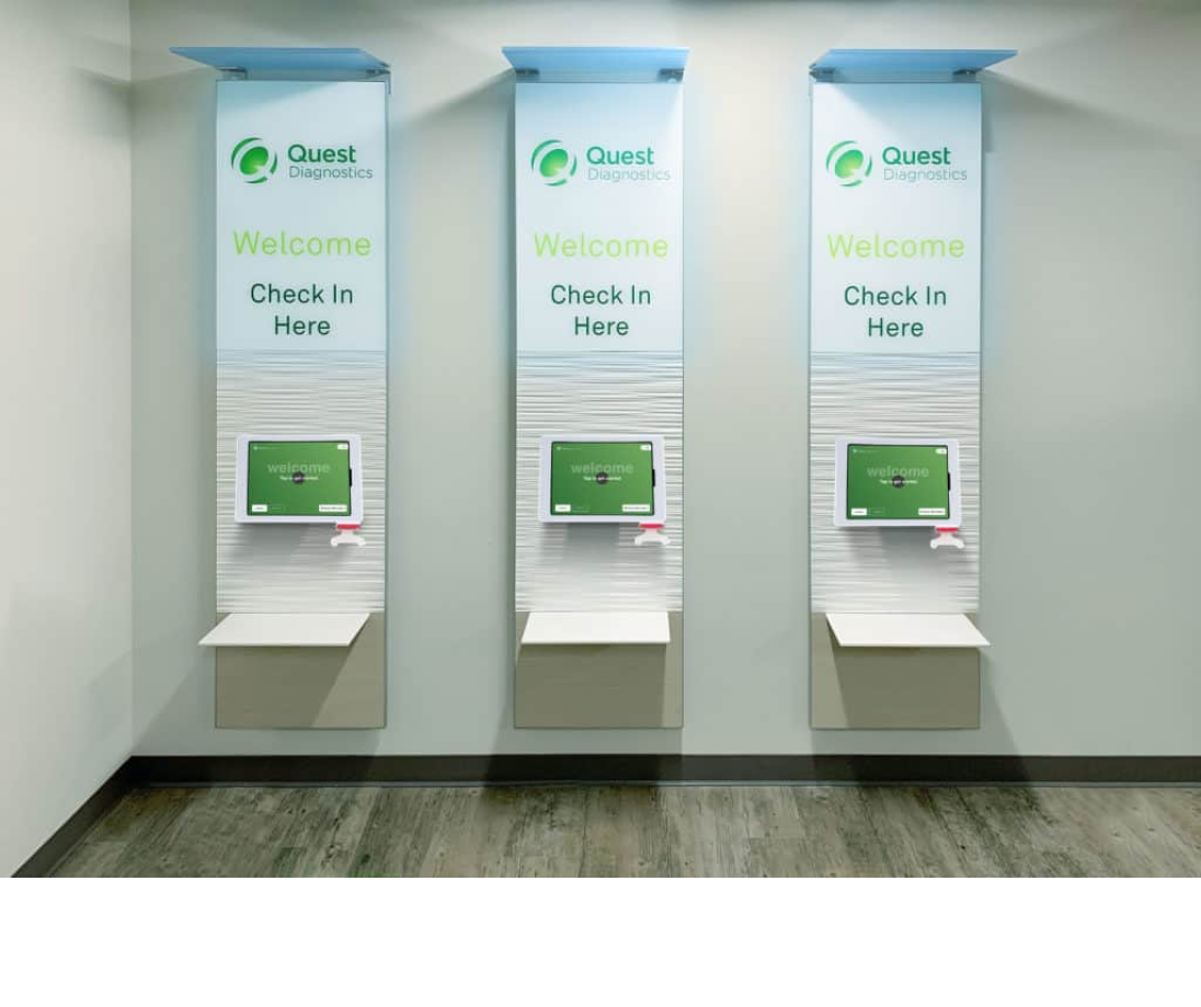
We developed a new check-in kiosk system that streamlines the process for both scheduled appointments and walk-in customers. The solution includes:
- Modern hardware setup featuring iPads with attached ID scanners for quick identity verification
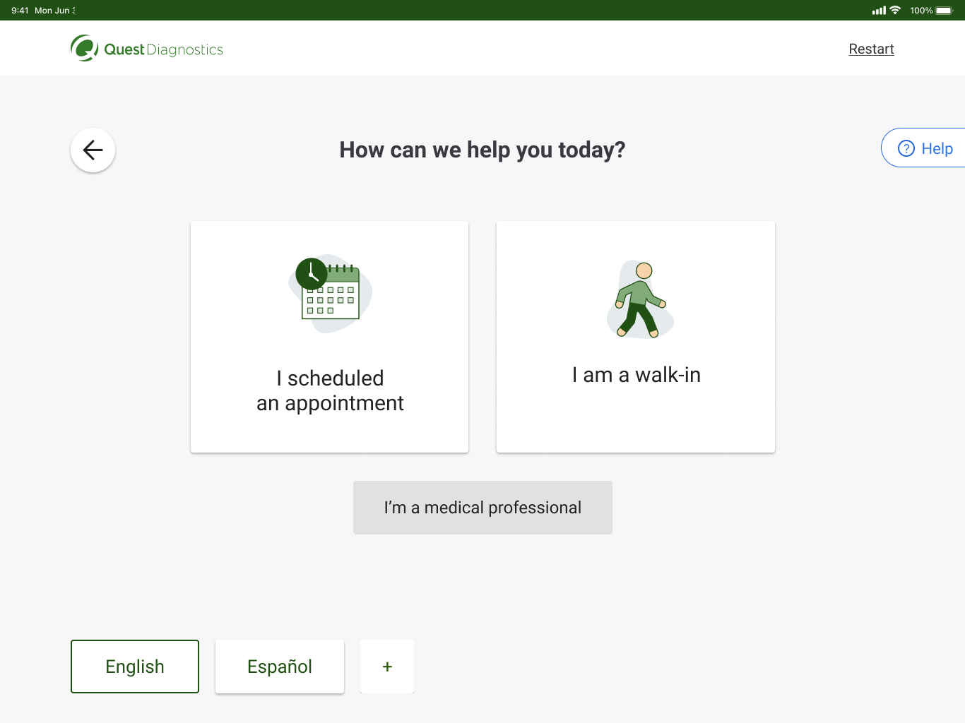
- Redesigned software interface supporting multiple check-in methods to accommodate different user preferences
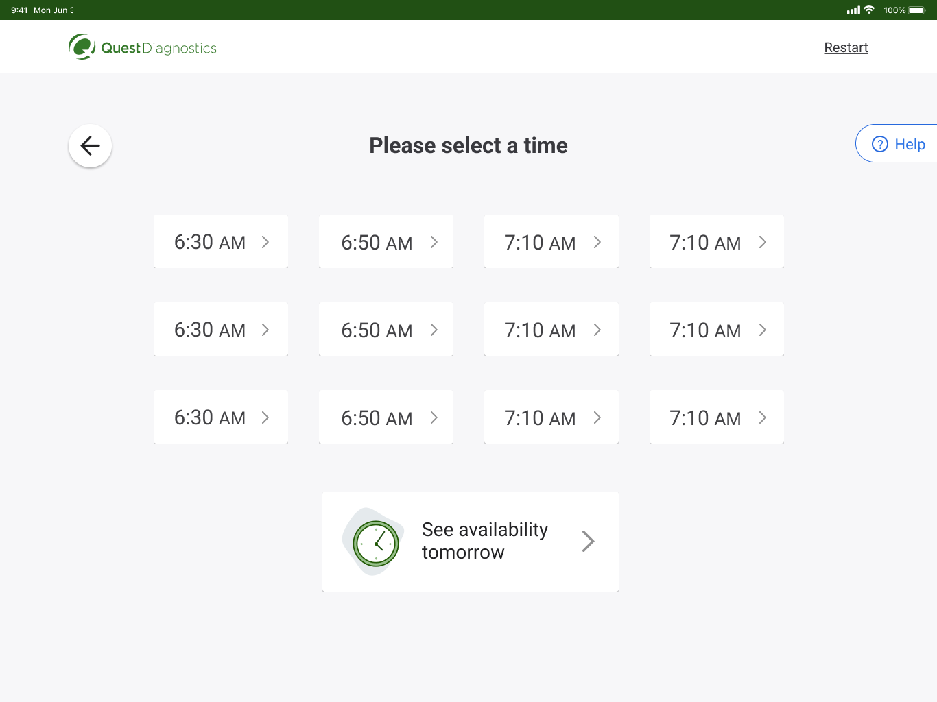
- Integrated appointment management system that handles both scheduled visits and walk-ins efficiently
This new system significantly reduces wait times and allows phlebotomists to focus on their core responsibilities rather than customer management tasks.
Research
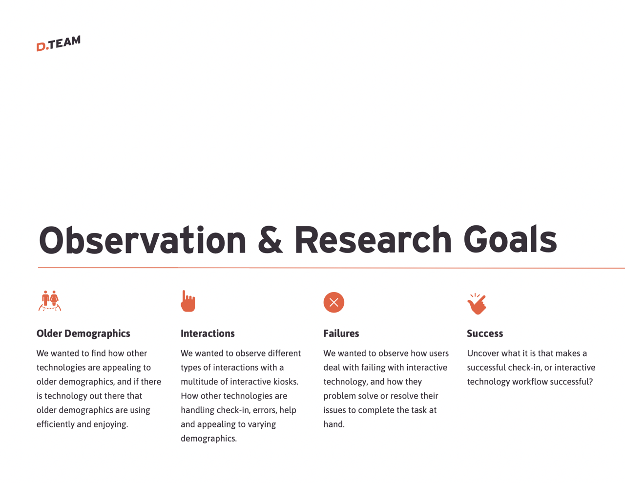
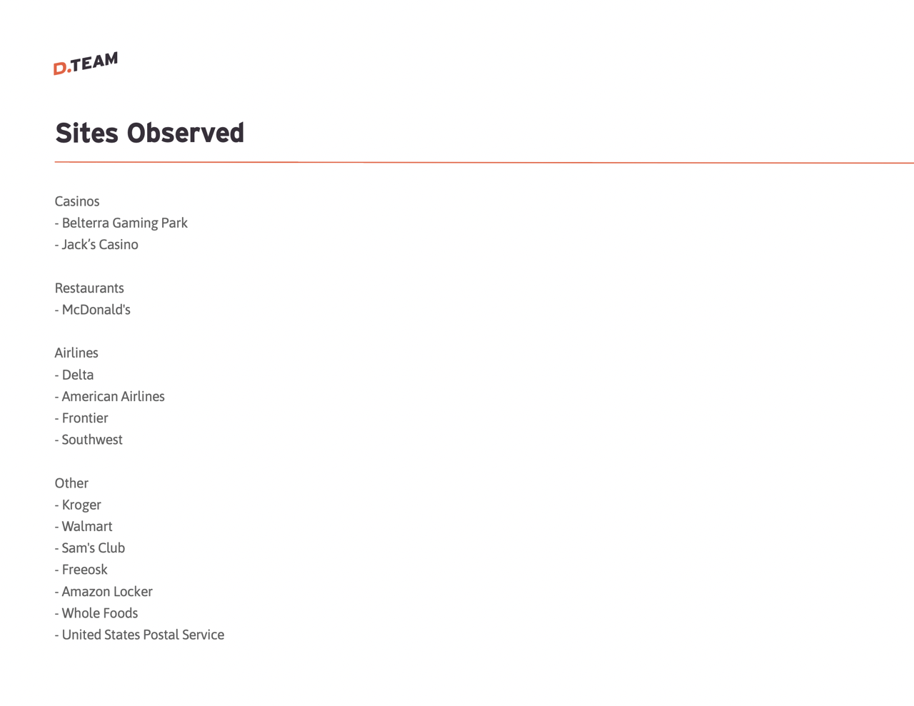
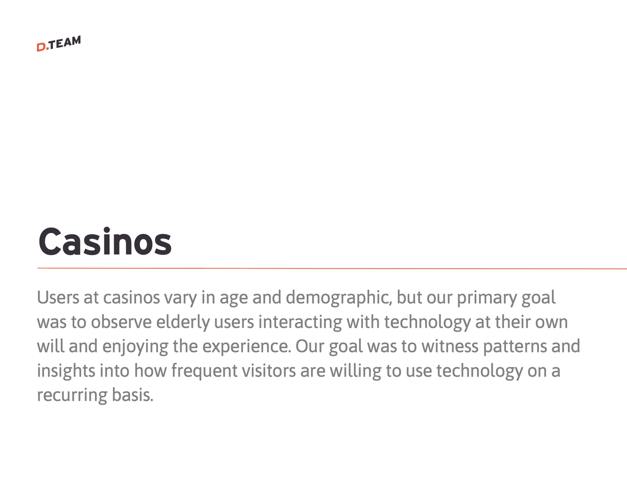
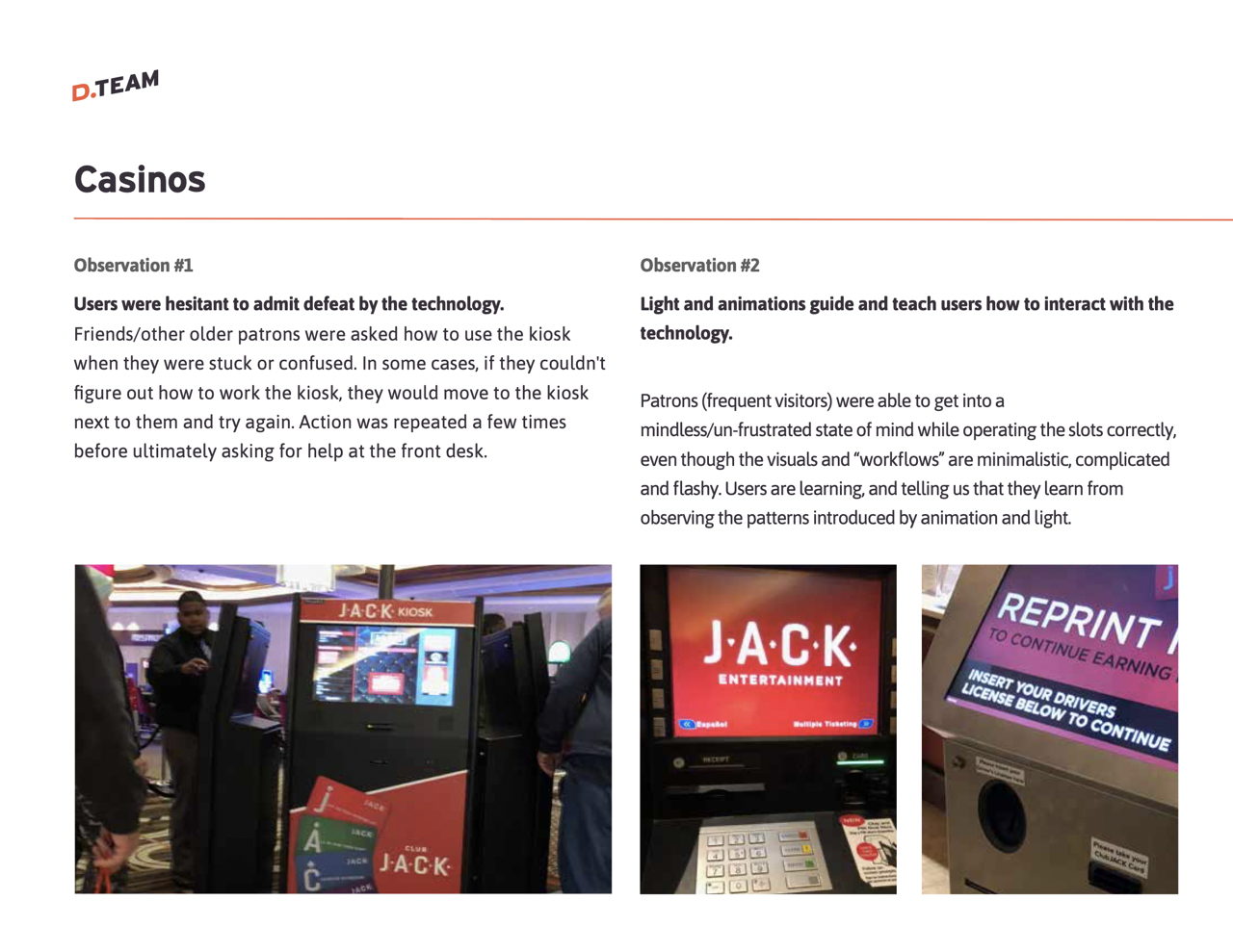
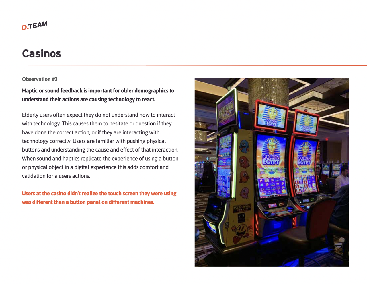
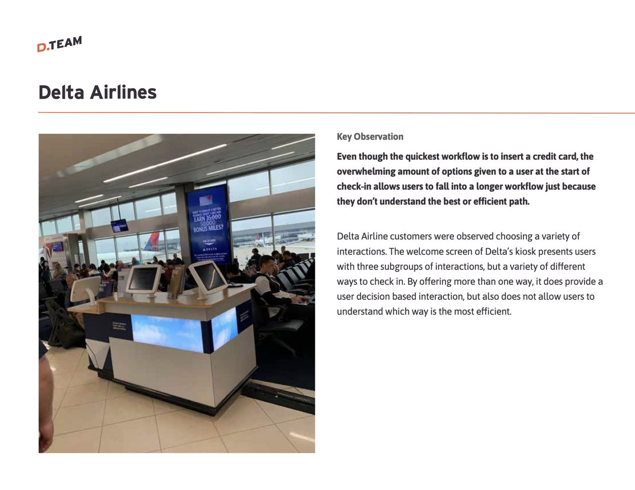
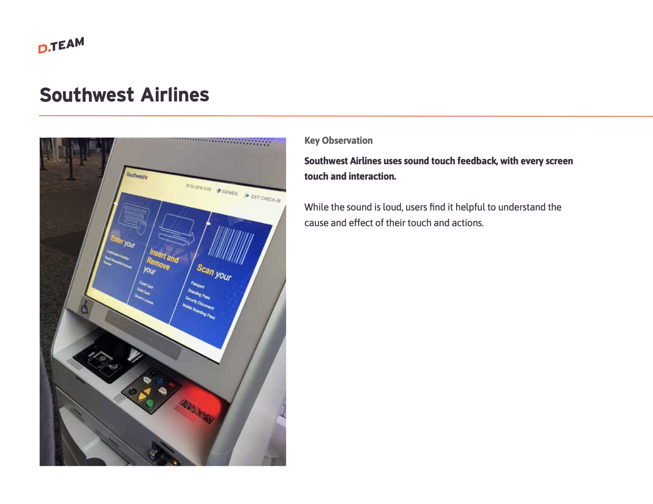
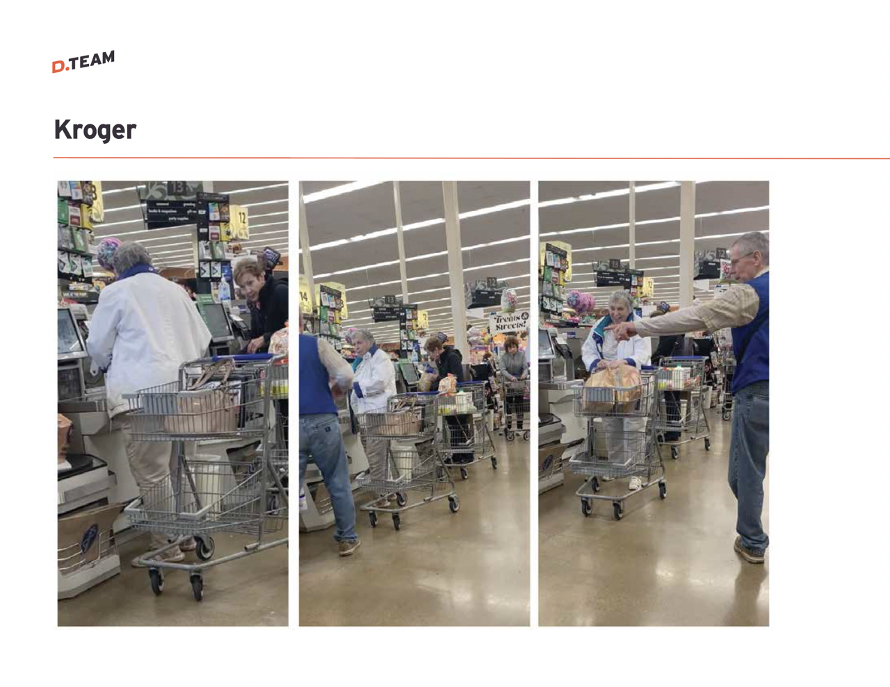
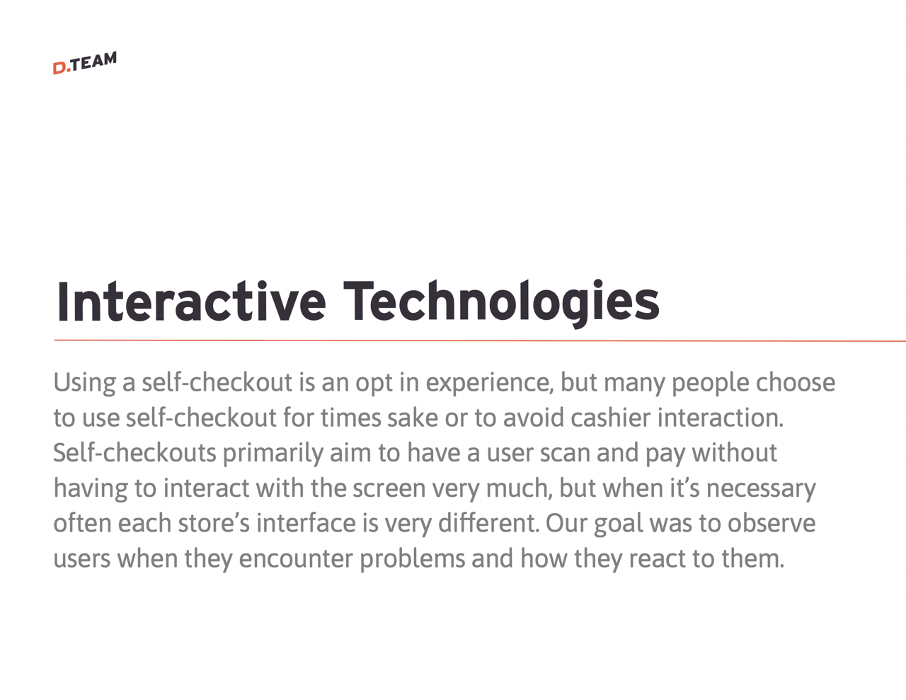
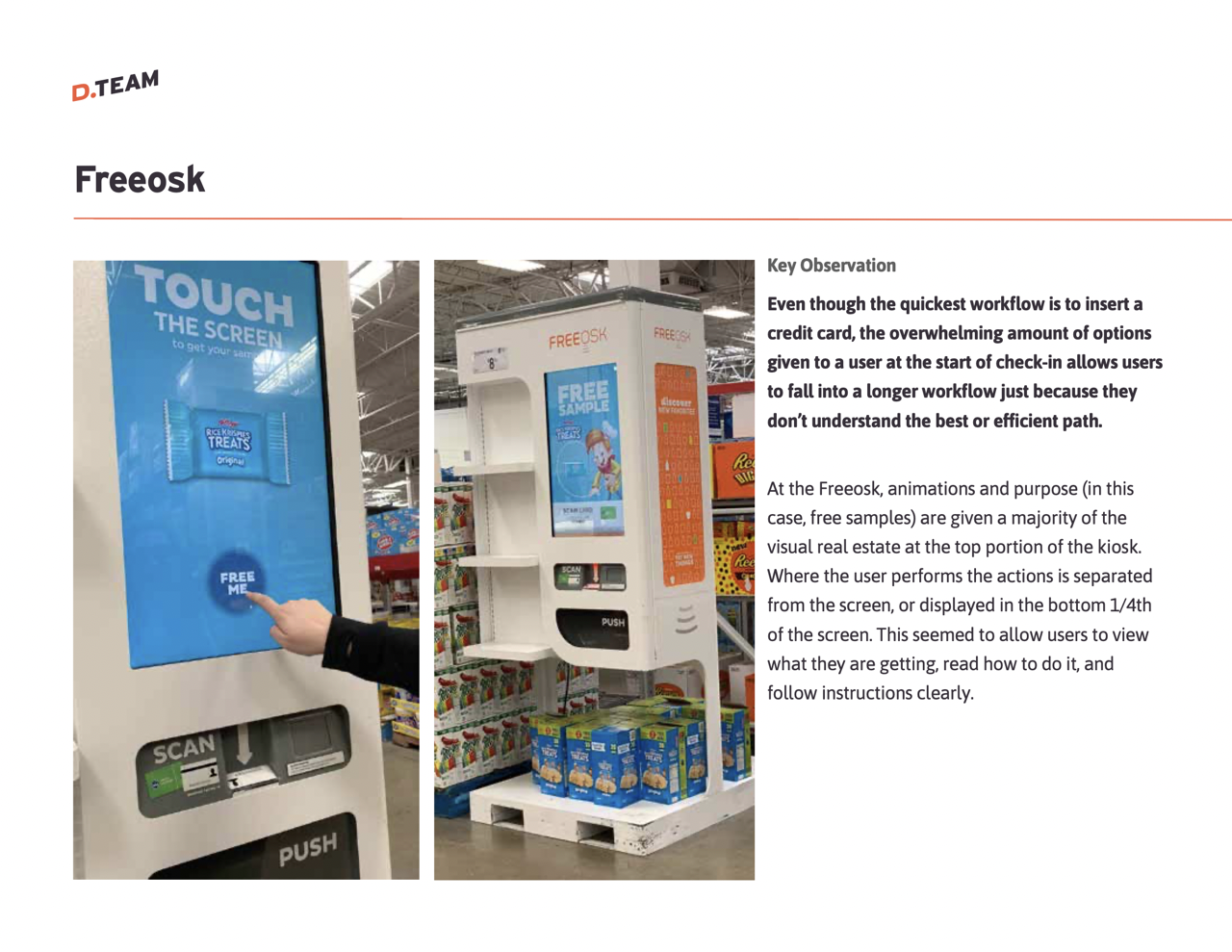
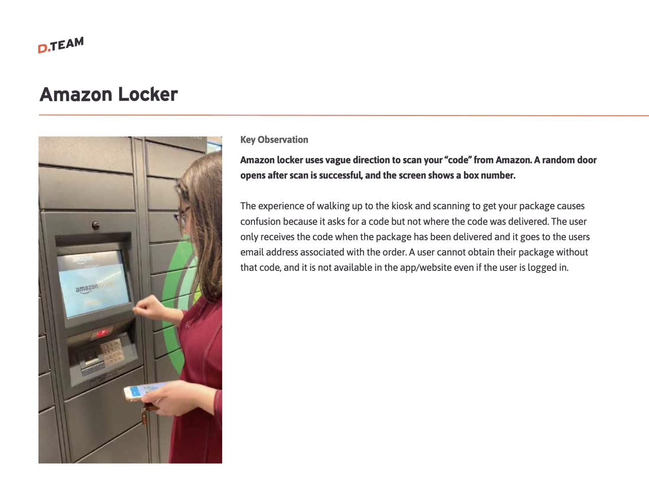
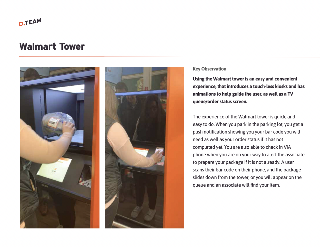
UX researchers went on multiple off-sites to test other kiosk experiences and to observe older demographics interacting with this technology. This included airports, casinos, retail and Quest locations.
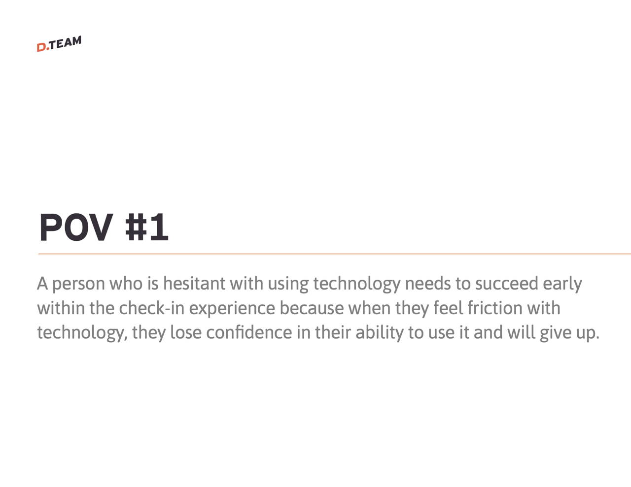
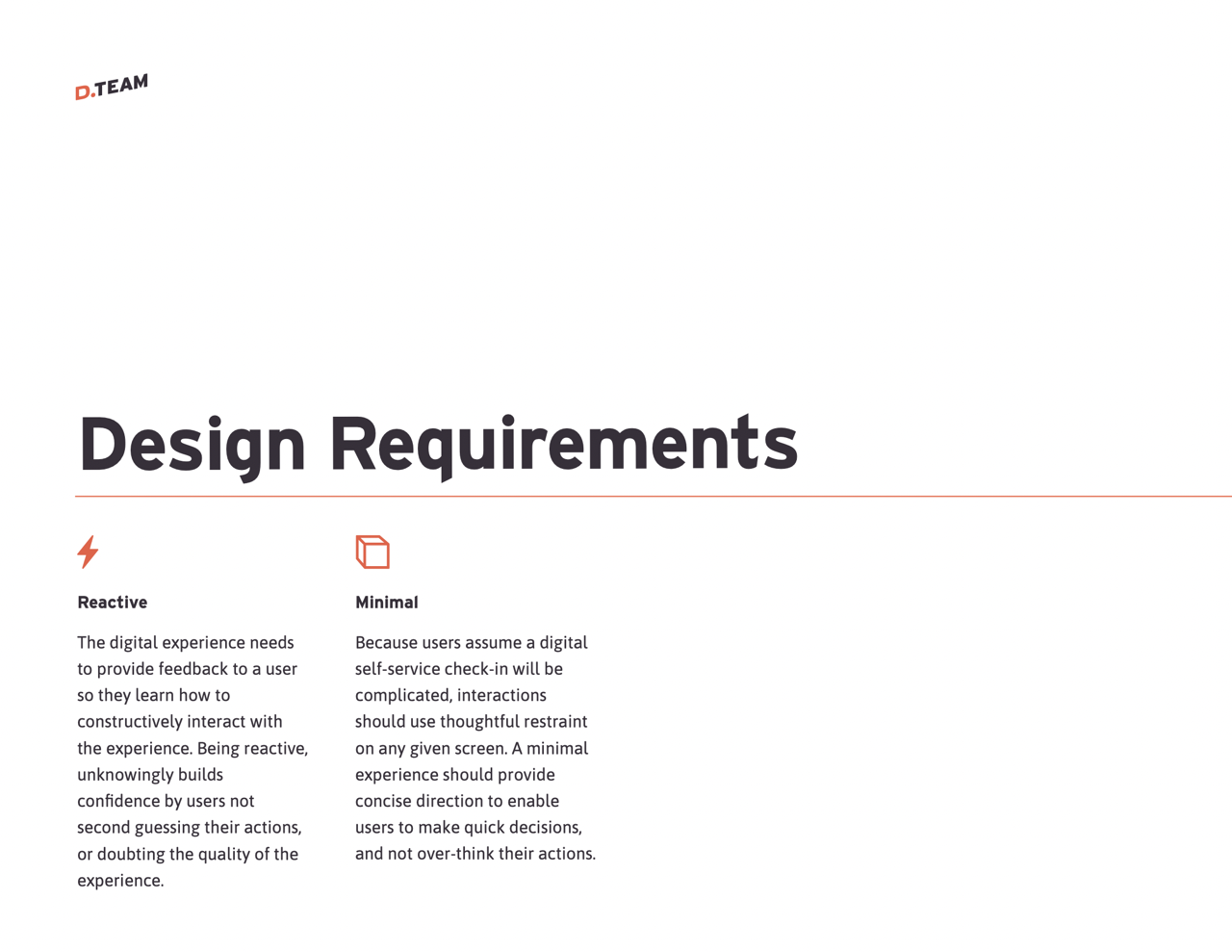
- Found that older users struggle with complex workflows and benefit from simplified, guided experiences with clear instructions and feedback.
- Highlighted that visual aids, sound, and haptics improve user confidence and ease navigation, especially for those unfamiliar with digital tools.
- Noted that initial screens with too many options lead to confusion, making a streamlined start critical for effective task completion.
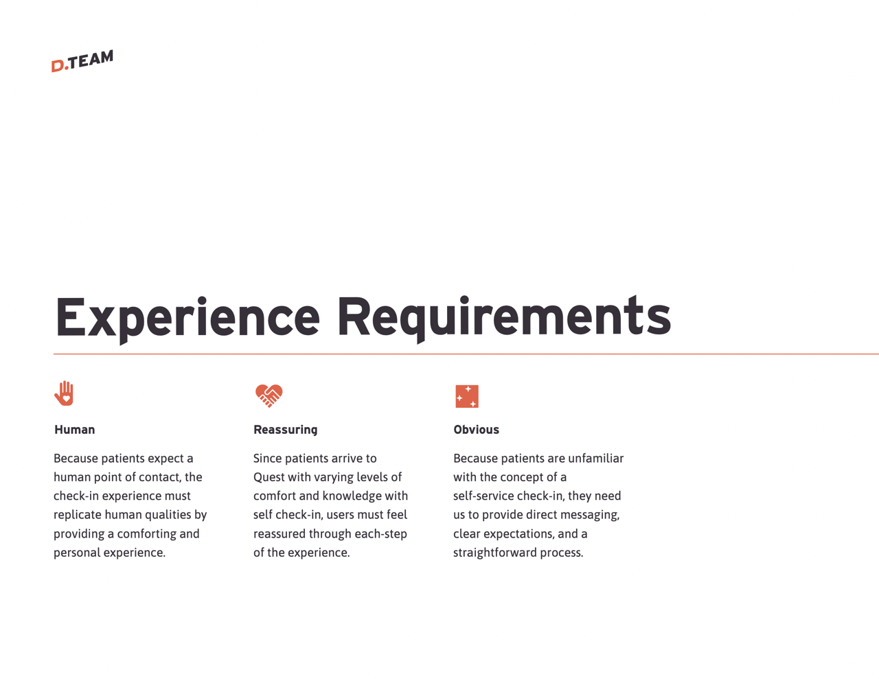
- Emphasized the importance of human-like, comforting interactions in medical check-ins to reduce patient anxiety with self-service technology.
Designing the User Flow
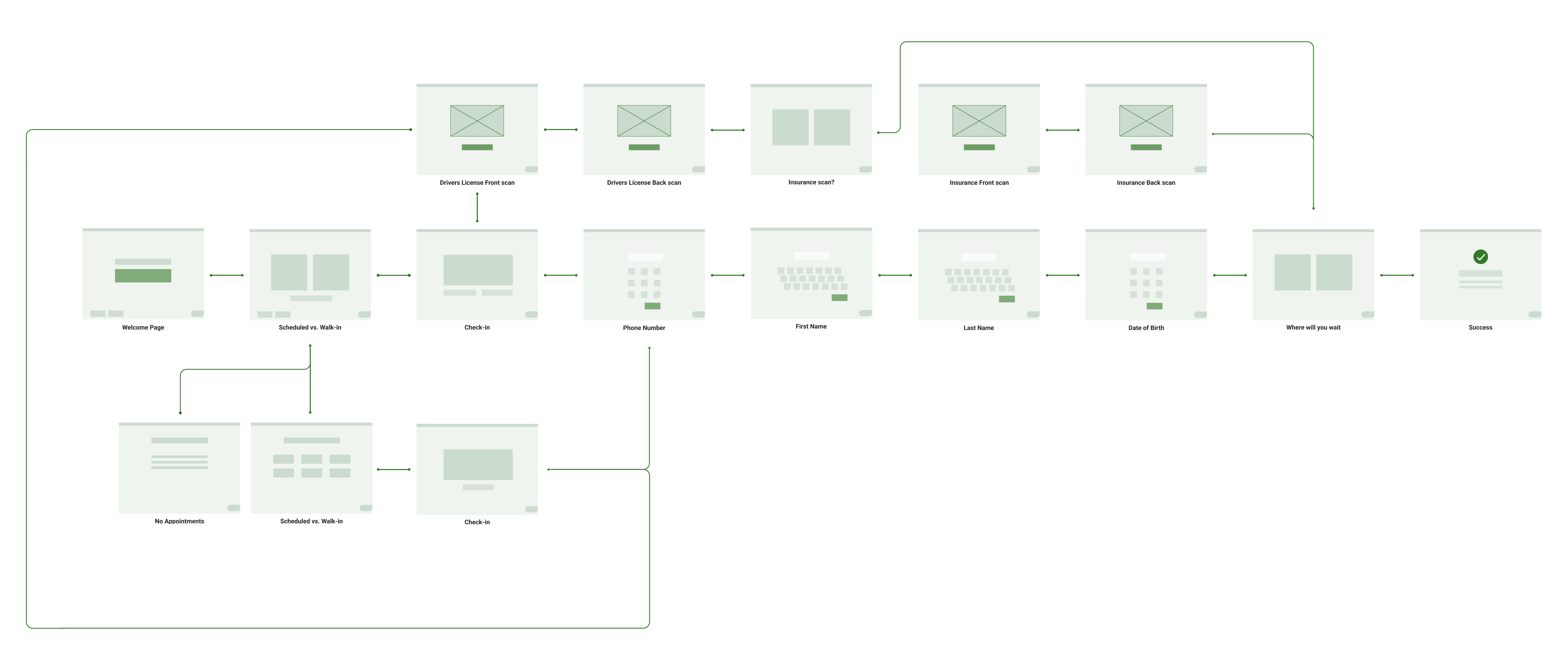
Based on these insights, we created a user flow that prioritizes simplicity and clarity while accommodating diverse user needs.
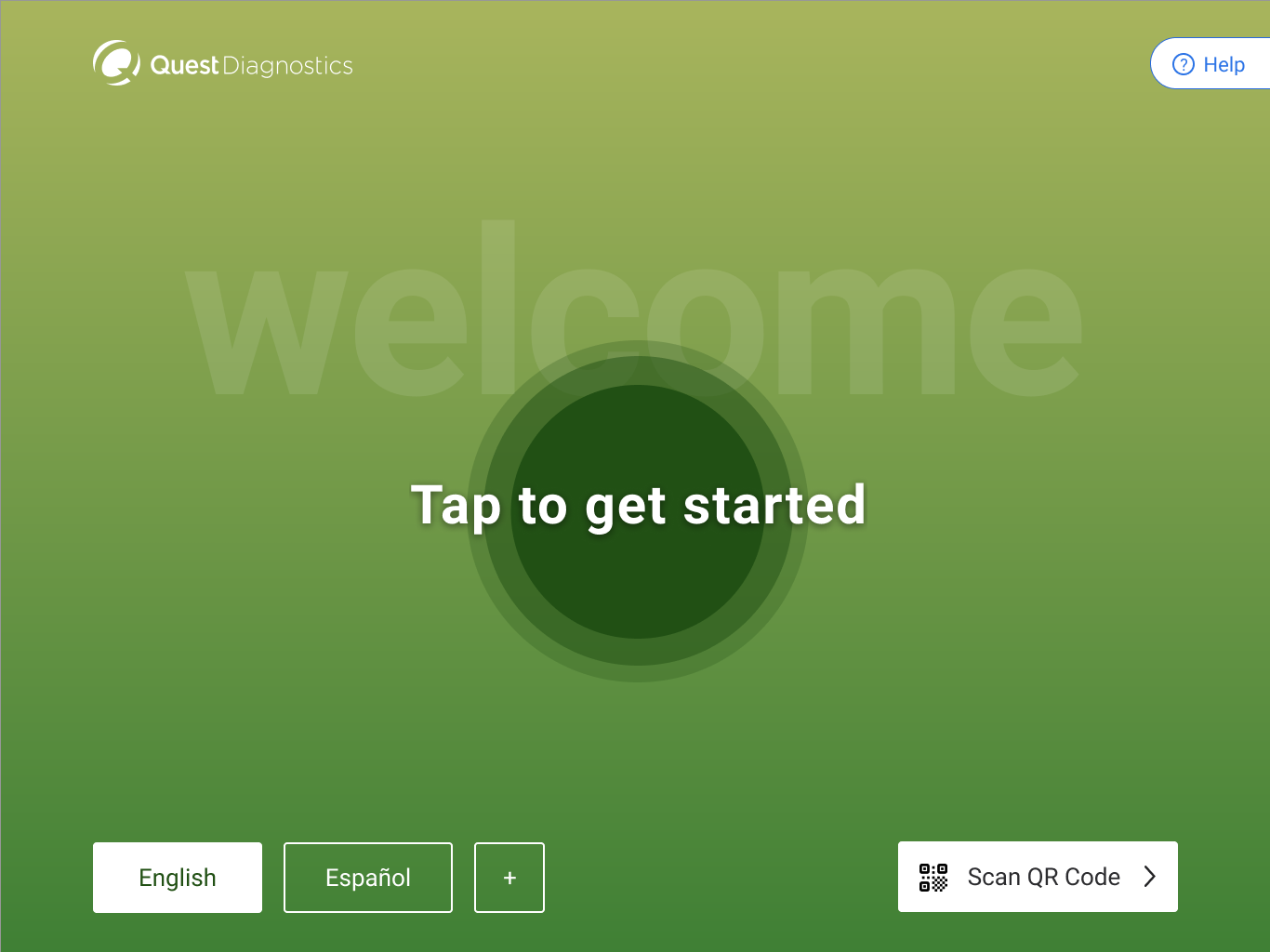
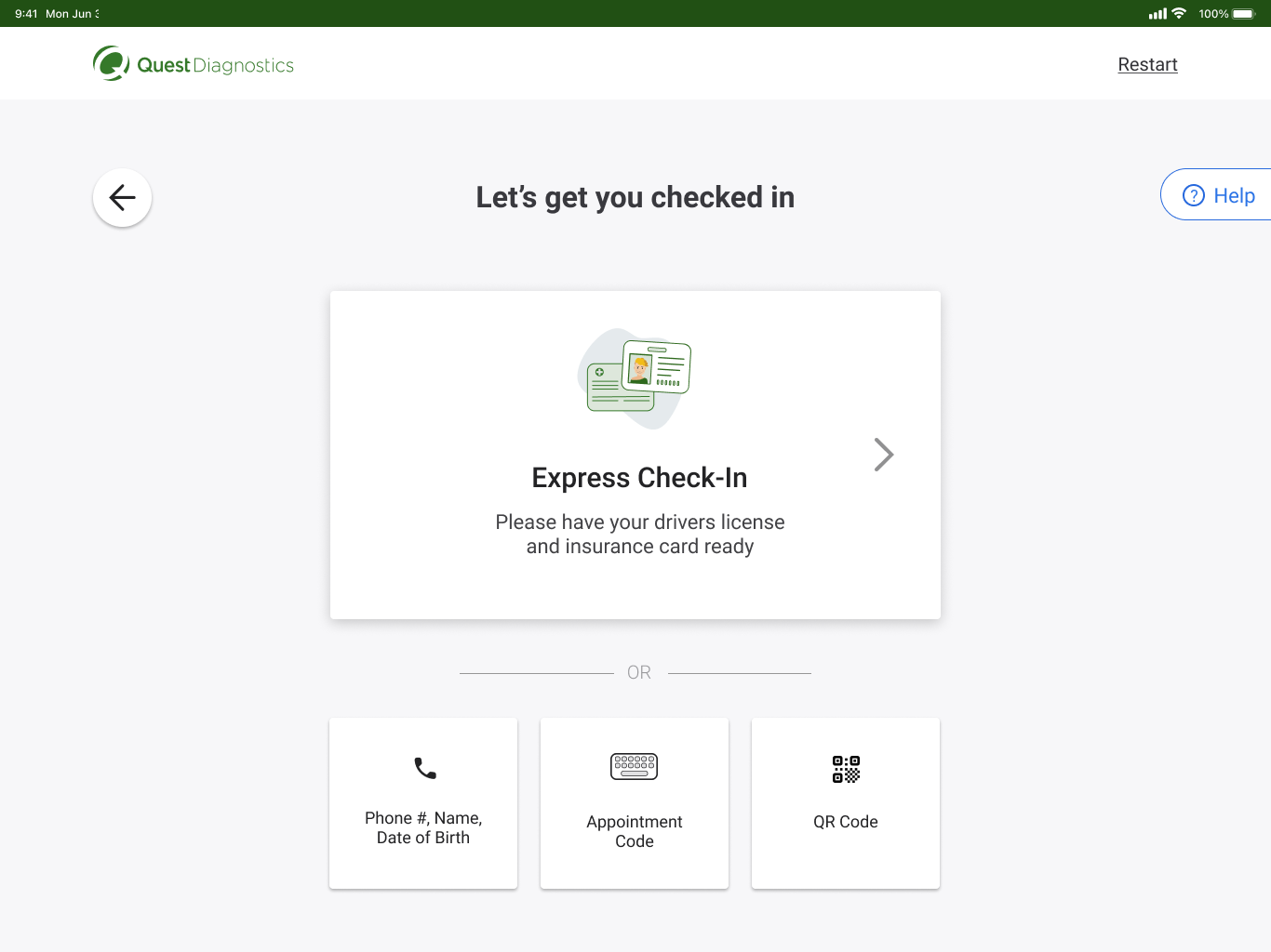
- Starts with a simple, welcoming screen that clearly differentiates between scheduled appointments and walk-ins
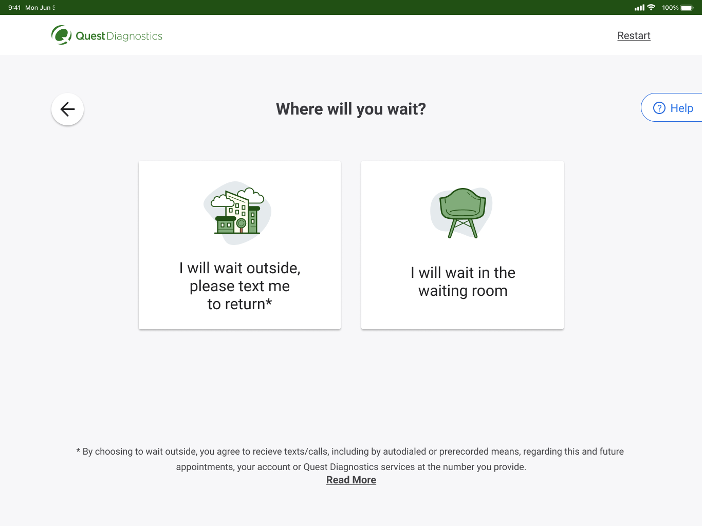
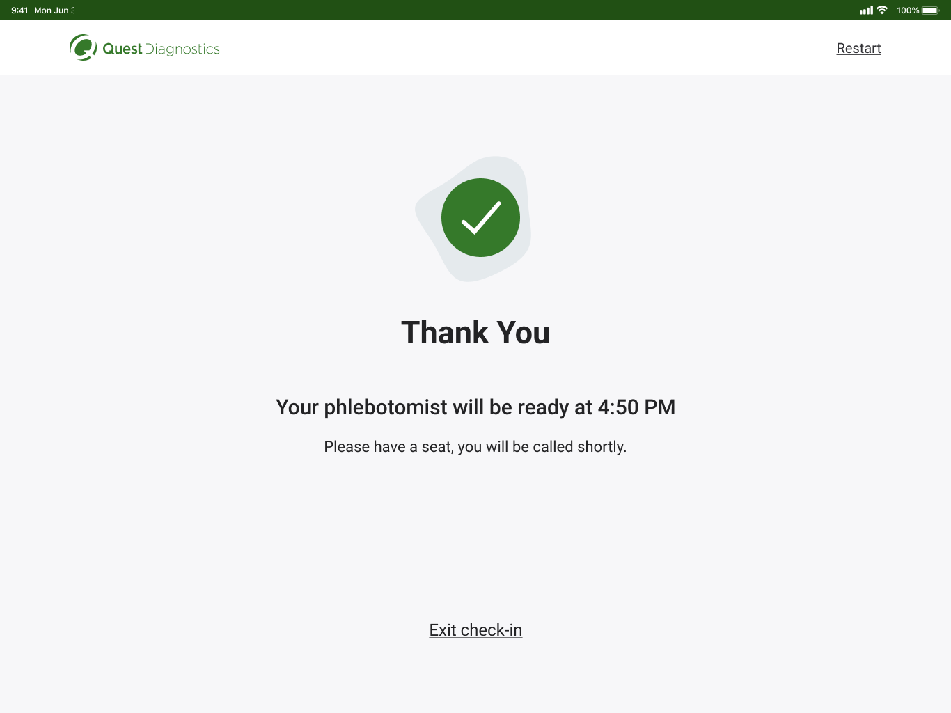
- Incorporates visual aids and feedback mechanisms throughout the process
- Provides step-by-step guidance with clear instructions at each stage
- Utilizes multiple check-in methods, including ID scanning, to accommodate different user preferences
Iterative Refinement
We continuously refined our user flows through:
- Usability testing with diverse user groups, particularly focusing on older demographics
- Feedback sessions with phlebotomists to ensure the new system alleviates their administrative burden
- A/B testing of different flow variations to optimize for efficiency and user satisfaction. Utilized usertesting.com to run 1,000+ tests.
Final Design
The final design was a modern, user-friendly interface that streamlined the check-in process for both scheduled appointments and walk-ins.
Working closely with our UI developer, we ensured that every interaction was meticulously implemented according to the design specifications. Through regular code reviews and collaborative testing sessions, we refined animations, touch interactions, and accessibility features to create a seamless experience that matched our design vision while maintaining optimal performance on the kiosk hardware.
