Cequence Design System
Project Impact
Problem Statement
The existing UI system lacked a unified, scalable theming structure, leading to inconsistencies across applications and redundant CSS overrides. There was a need for visual uniformity and a more streamlined approach to managing themes and components across both dark and light modes.
Solution
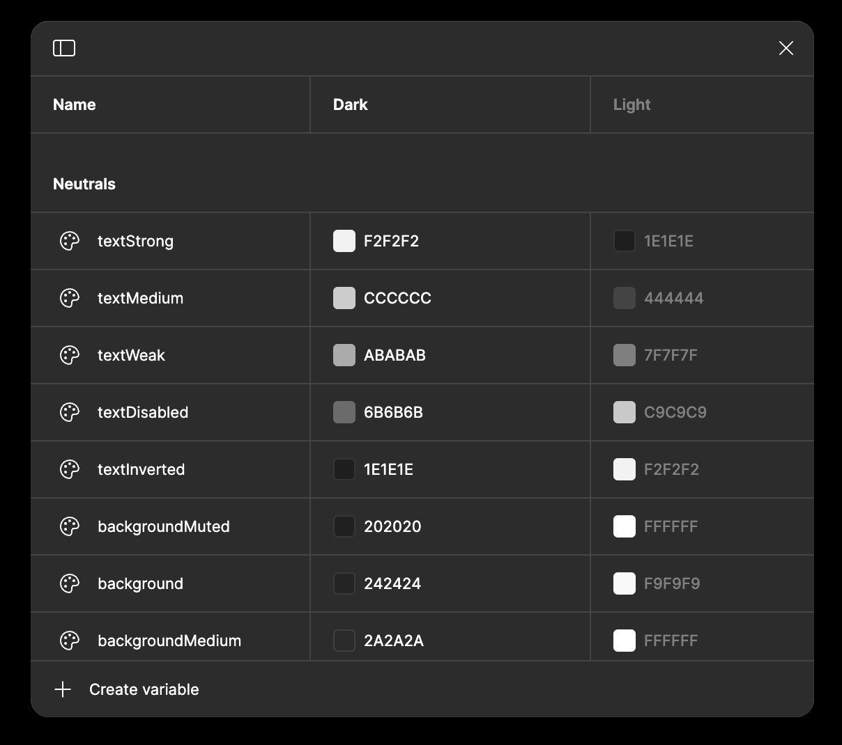
1. Adoption of Figma's Variable Control System (2023)
- Figma introduced native design tokens, which I leveraged to overhaul our design system.
- Created a structured theme palette with design token variables, each with a specific, intentional purpose (e.g., text tokens labeled `neutrals/text/medium`).

2. Redesign of Figma Components
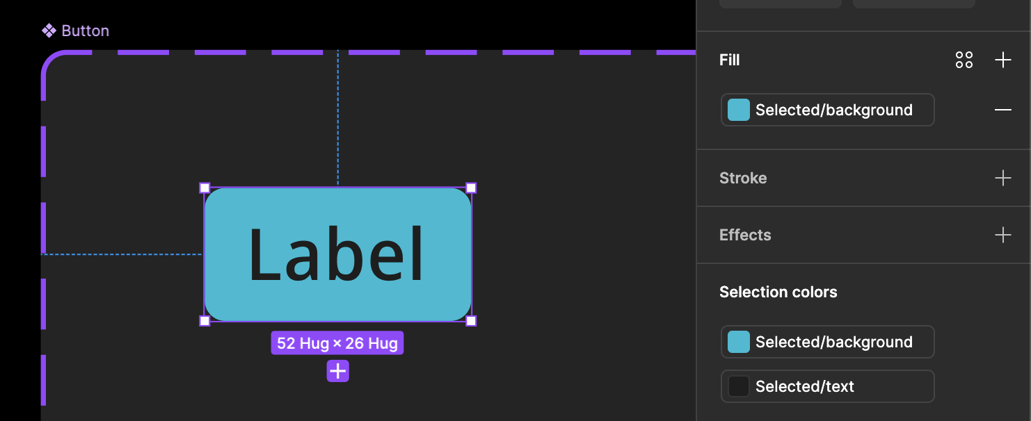
Applied the new token-based theming across all components in the Figma design library, ensuring consistency and seamless integration between designers and their files.

3. Integration into the UI-Components Repository
- Added Figma theme to our shared UI repository, integrating the design tokens into MUI themes for easy consumption by applications.
- Created a structured theme JSON file to define design tokens:
{ "neutrals": { "text": { "high": "rgba(255, 255, 255, 0.95)", "medium": "rgba(255, 255, 255, 0.80)", "low": "rgba(255, 255, 255, 0.60)", "disabled": "rgba(255, 255, 255, 0.40)" }, "background": { "primary": "#18181B", "secondary": "#27272A", "tertiary": "#3F3F46" }, "border": { "default": "rgba(255, 255, 255, 0.12)", "hover": "rgba(255, 255, 255, 0.20)" } }, "brand": { "primary": { "main": "#2563EB", "light": "#3B82F6", "dark": "#1D4ED8" }, "secondary": { "main": "#7C3AED", "light": "#8B5CF6", "dark": "#6D28D9" } }, "feedback": { "success": "#22C55E", "warning": "#F59E0B", "error": "#EF4444", "info": "#3B82F6" } } - Developed CSS overrides for MUI components to align them with the new token-based design system.
- Created semantic MUI component overrides to apply design tokens consistently:
{ MuiButton: { styleOverrides: { root: { backgroundColor: theme.brand.primary.main, color: theme.neutrals.text.high, '&:hover': { backgroundColor: theme.brand.primary.light }, '&:active': { backgroundColor: theme.brand.primary.dark }, '&.Mui-disabled': { backgroundColor: theme.neutrals.background.tertiary, color: theme.neutrals.text.disabled } }, outlined: { borderColor: theme.neutrals.border.default, '&:hover': { borderColor: theme.neutrals.border.hover, backgroundColor: 'transparent' } } } } } - Rethemed custom React components in the shared UI-components repository using the new tokens.
4. Dark & Light Theme Compatibility
Ensured that design tokens seamlessly supported both dark and light themes for greater flexibility in user interface preferences.
5. Collaborative Application Retheming
- Removed redundant CSS overrides in applications, replacing them with standardized overrides from the shared UI repository.
- Conducted an in-person retheming session with the UI engineering team, where we collaboratively rethemed components like buttons, icons, and text fields, removing thousands of lines of CSS.
6. Ongoing Evolution
- Owned the remaining effort to fully transition applications to the new theme.
Impact
Consistency
Achieved visual uniformity across all applications, giving them a cohesive and professional appearance.
Efficiency
Removed thousands of lines of redundant CSS, streamlining the development process.
Accessibility & Usability
Leveraged MUI's built-in features to improve the accessibility of the applications.
Flexibility
Enabled a fully functional light mode for users, broadening the product's adaptability.